Week 2: Data visualization
1 Materials from lecture
These notes are adapted from Data visualization and Layers chapters in R for Data Science
2 Visualization with ggplot2
There are many ways to visualize data with R. One great option is ggplot2. Note that ggplot2 is one of the core pacakges in the tidyverse, a family of packages for datascience with R. We’ll learn more about this package next week.
ggplot2makes use of a system for describing and creating graphics known as the layered grammar of graphics- learning this one simple system allows you to generate many different types of plots
To create a plot with ggplot2, you call the function ggplot(), which creates a plot object Then you add layers to the object. There are 3 basic requirements for every ggplot:
- data - what dataset are you ploting? Including only data generates an empty canvas
- aesthetics - define how variables in your dataset are mapped to visual properties in the plot
- geoms - determine the geometrical object that a plot uses to represent the data
We can think of the following as a basic template for any ggplot:
ggplot(
    data = <DATA>,
    mapping = aes(<MAPPINGS>)
) +
 <GEOM_FUNCTION>
One common warning you will encounter is about missing values. ggplot2 will always let you know that some of your data could not be plotted in the way you specified. Usually this is good to know, but nothing to worry about:
Removed n rows containing missing values
We won’t cover everything you can do with ggplot2 (that would be a lot!) In lecture we’ll demo the most common features, but you should feel comfortable using ggplot2’s function reference to figure out how to do other things.
3 Aesthetics
There are two ways we can determine the aesthetics of a plot:
- mapping allows us to determine aesthetics based on a variable, which are passed as arguments. e.g.
mapping=aes(color=var). - setting allows us to set aesthetics to a constant value, which are passed as their own argument e.g.
color=var
When we map categorical variables to aesthetics, ggplot2 assigns a unique value of the aesthetic to each unique value of the variable.
- This process is known as scaling; we can override the scale ggplot2 selected by adding a
scaleslayer. - ggplot2 also automatically creates a legend to describe the mapping for us (except for x and y aesthetics, where ggplot2 simply creates the axis – no legend is necessary).
When we set aesthetics, we must select the value for the aesthetic manually.
- color and fill - set name of a color as a string, e.g.
color="blue" - alpha - set value between 0 and 1, where 0 is most transparent, e.g.
alpha=0.5 - size - set size of point in mm, e.g.
size=1 - shape - set shape of point as a number 1-25, e.g.
shape=1. There are 25 built in shapes (see below) - linetype - a name of “blank”, “solid”, “dashed”, “dotted”, “dotdash”, “longdash”, “twodash”, e.g.
linetype="dotted"
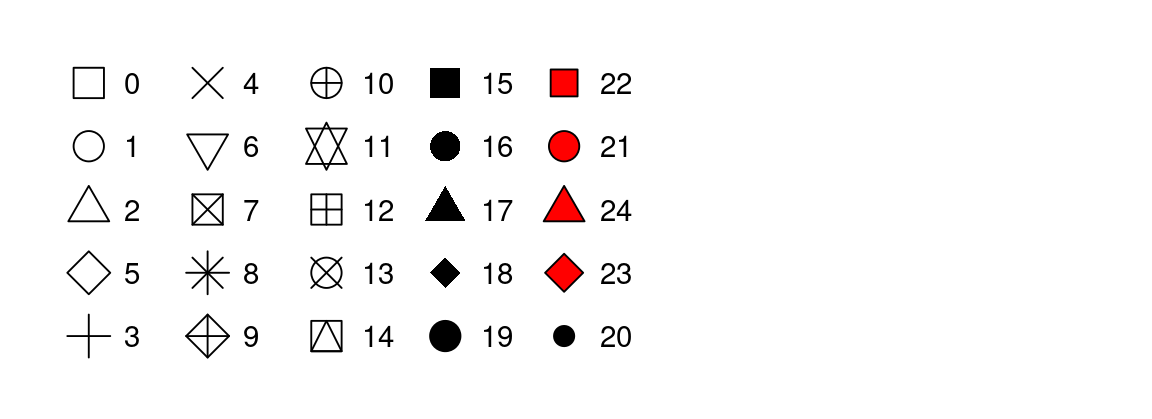
There are 3 common warnings people encounter when mapping categorical variables
- The shape palette can deal with a maximum of 6 discrete values
- Removed n rows containing missing values
- Using alpha for a discrete value is not advised.
- The first two happen when mapping shape, because by default ggplot2 will use no more than 6 shapes at a time (and any additional levels are discarded)
- The last one happens when mapping size or alpha, because it is strange to map an unordered categorical variable to an ordered aesthetic. Size and alpha imply there is some ranking but there is none!
4 Geoms
Geoms are the geometric objects used to represent the data in your plot. To change the geom, simply change the geom function
geom_histogram()- histogram, distribution of a continuous variablegeom_density()- distribution of a continuous variablegeom_bar()- distribution of categorical datageom_point()- scatterplotgeom_smooth()- smoothed line of best fit- All available geoms
Mapping and data: Every geom function takes a mapping argument and a data argument, both can be defined either globally in the ggplot() layer or locally in the geom layer. When defining mappings or data locally in the geom layer, remember:
- they are local, meaning they only apply to that specific layer
- they will extend or override any global mappings or data you specified in
ggplot() - they (usefully!) allow you to specify different aesthetics or data in different layers
Position: Every geom also takes a position argument, which adjusts the position of the geom. We will encounter this most often in geom_bar() and geom_point():
For
geom_bar(), the default position is stacked, e.g.position="stacked", but there are 3 other options: (1) dodge would place overlapping bars next to each other, (2) fill would make each set of stacked bars the same height (a relative frequency plot), (3) identity would make the bars overlapping (which isn’t very useful – we’d only see the tallest one!)For
geom_point(), setposition="jitter"to add a small amount of random noise to each point, which speads them out! Technically makes your plot less accurate, but can also reveal important information. (geom_jitter()is shorthand forgeom_point(position="jitter"))
Stat: All geoms also take a stat argument, which is short for statistical transformation. Many geoms have stat="identity" as their default argument, which means they plot the raw (untransformed) data from your dataset (geom_point() is one of them!). But some geoms do calculate new values to plot by default. For example:
geom_bar()andgeom_histogram()bin the data and plot the bin counts (the number of points that fall in each bin) by defaultgeom_smooth()fits a model to your data and plots the prediction from the modelgeom_boxplot()computes the five-number summary of the distribution (more on this next week!) and then display that number as a summary
Usually we use the default stat, so we don’t need to specify it at all. But sometimes when making geom_bar() plots, we want to override the default to stat="identity" to make the height of the bars map to the raw values of a y variable.
Other geom-specific arguments: Certain geoms make frequent use of other more specific arguments. Two we will encounter often are:
- For
geom_smooth(), we set the smoothing method with the method argument, e.g.method="lm" - For
geom_histogram(), we set the number of bins with the bins argument or the width of the bins with the binwidth argument, e.g.binwidth=30.
5 Other layers
There are many other layers that can be specified in ggplot2 to create more complex plots. I find Figure 2 below helpful in understanding the layered nature of the grammar of graphics.
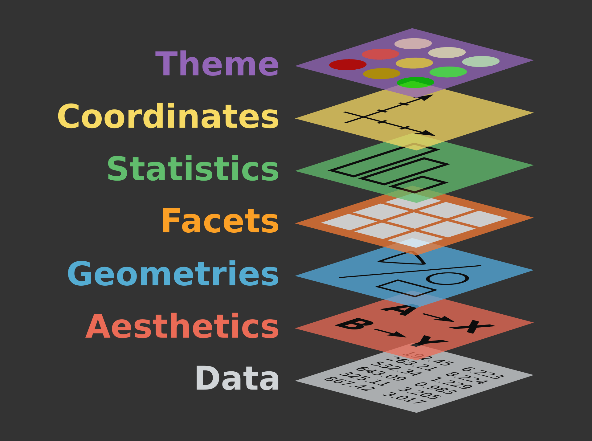
Below we’ll outline some common uses for the following layers. We will demo most of this in class, but a few of them might be new to you!
- facets - display subsets of data
- labels - modifies axis, legend and plot labels
- themes - overall visuals
- scales - map data values to visual values of aestetic
5.1 Facets
Facets are smaller plots that display different subsets of the data. They are often used as an alternative to aesthetics to plot additional categorical variables.
facet_wrap(~var)- splits a plot into subplots based on a categorical variable; each subplot displays a subset of the data. The ncol argument takes a number and specifies the number of columns.facet_grid(rows~cols)- splits a plot into subplots with the combination of two variables, one as the rows of the facet and one as the columns. To leave off rows (or cols), use the., e.g.facet_grid(.~species)scales- by default facets share the same scale and range for x and y aesthetics. Set thescalesargument to “free” to allow for different axis scales, e.g.scales="free"
5.2 Labels
The labs() functions allows you to modify axis, legend, and plot labels. labs() takes several arguments.
Some are a straightforward name, like:
- title - plot title
- subtitle - plot subtitle
- caption - caption at bottom right of plot
Others are mapped to aesthetics, like:
- x - the x axis label
- y - the y axis label
- color - the legend for the color aesthetic
- size - the legend for the size aesthetic
5.3 Themes
ggplot2 comes with many complete themes which control how everything is displayed (except data!). A few favorites include:
theme_gray()- the defaulttheme_bw()- classic dark-on-light themetheme_minimal()- minimal theme with no background annotationstheme_classic()- a classic looking theme with no gridelines
Themes take a few arguments, two of which we may use in the class:
- base_size - base font size, given in pts
- base_family - base font family to use
5.4 Scales
Scales control the details of how data values are translated to visual properties. Adding a scale layer overrides the default scales that ggplot2 uses automatically. There are many kinds of scales, but we will mostly encounter them when changing colors of things:
scale_color_brewer()- changes the color, allows you to select color palettes from the RColorBrewer package with palette argument, e.g.palette="Greens"scale_fill_manual()- also changes the color, set to manual values with values argument, e.g.values=c("green", "blue", "red")
6 Shortcuts
When calling ggplot2 (or any function!) we can specify argument names explicitly or leave them off (implicit). Leaving off the names makes code more conscise, so you’ll typically see it that way.
explicit naming of arguments allow us to write them in any order (because we indicate them to ggplot2 by their name)
ggplot(
    data = my_data,
    mapping = aes(x = weight, y = height)
)
implict argument names means we have to specify them in a perscribed order (data first!) so ggplot2 can identify them without their name
ggplot(
    my_data,
    aes(x = weight, y = height)
)
Another shortcut you’ll encounter is the pipe operator, %>%. The pipe takes the thing on its left and passes it along to the function on its right (as the function’s first argument). We’ll work with the pipe more next week.
x %>% yis equivalent tof(x, y)since the first argument to ggplot() is data, you’ll typically see the pipe used like this:
my_data %>%
ggplot(
    aes(x = weight, y = height)
)
7 Saving plots
Often we want to save a plot (to add it to a presentation or paper). We can accomplish this with ggsave().
# save your most recent plot with the name
ggsave("myfigurename.png")

# specify the width and height; can also specify which units you mean
ggsave("myfigurename.png", width = 4, height = 4)
ggsave("mtcars.pdf", width = 20, height = 20, units = "cm")
In Google Colab, you can find your saved plot by clicking the file icon on the left side bar.
8 Further reading
Recommended further reading:
- Data visualization in R for Data Science
- https://moderndive.com/2-viz.html
- Layers in R for Data Science
Other useful resources: