Data Visualization Day 2
Data Science for Studying Language and the Mind
2024-09-05
Announcements
Permits have been issued! If you are on the waitlist and have not been issued a permit, please email me!
The Friday 12pm lab has 8 more seats 🙂
The course we be reopened to regular enrollment today
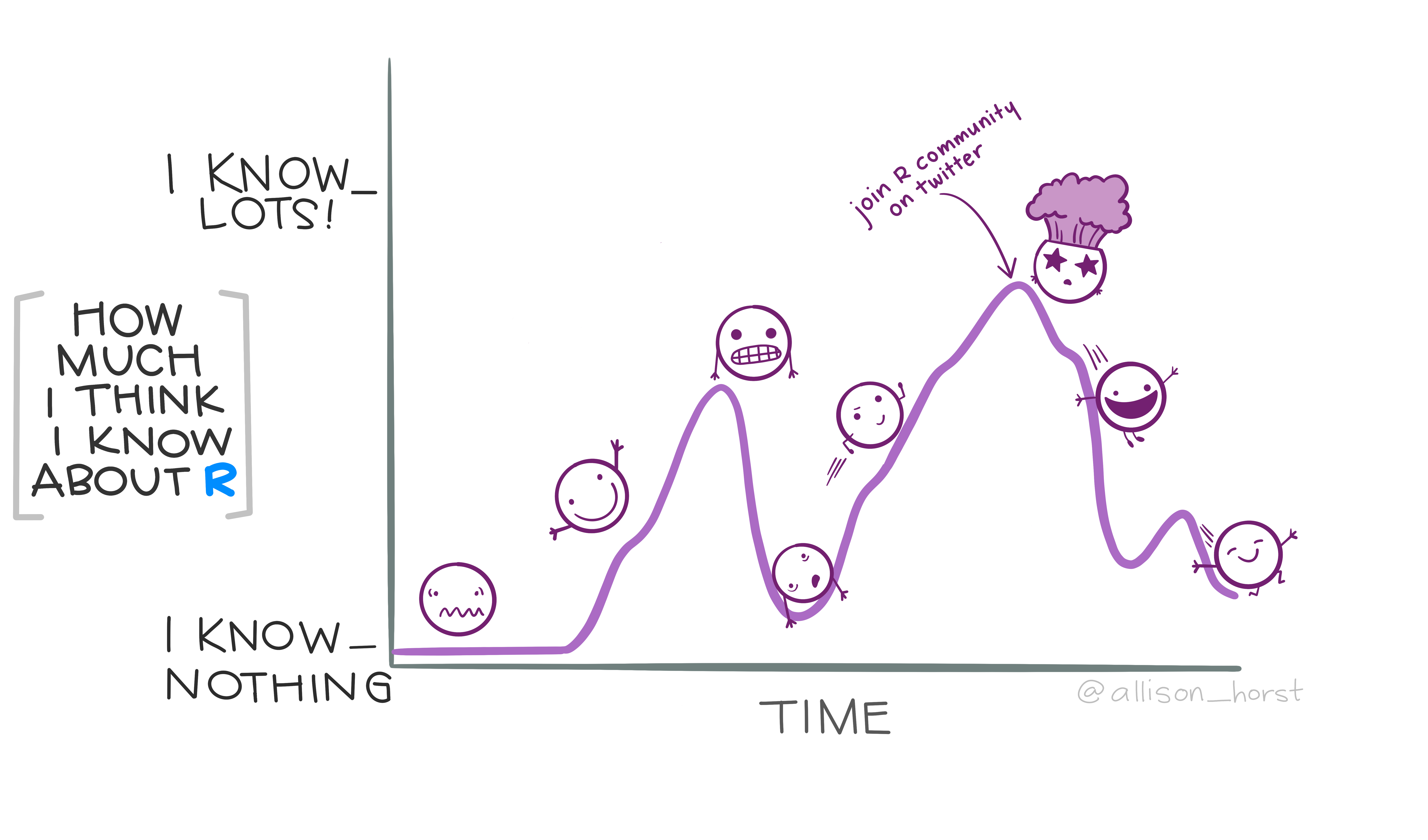
How are we feeling today?

You are here
Data science with R
- R basics
Data visualization- Data wrangling
Stats & Model buidling
- Sampling distribution
- Hypothesis testing
- Model specification
- Model fitting
- Model accuracy
- Model reliability
More advanced
- Classification
- Inference for regression
- Mixed-effect models
Acknowledgements
Adapted from R4DS Ch 9: Layers and some materials by Dr. Colin Rundel at Duke

Google Colab already has ggplot2 installed by default. There is no need to run install.packages().
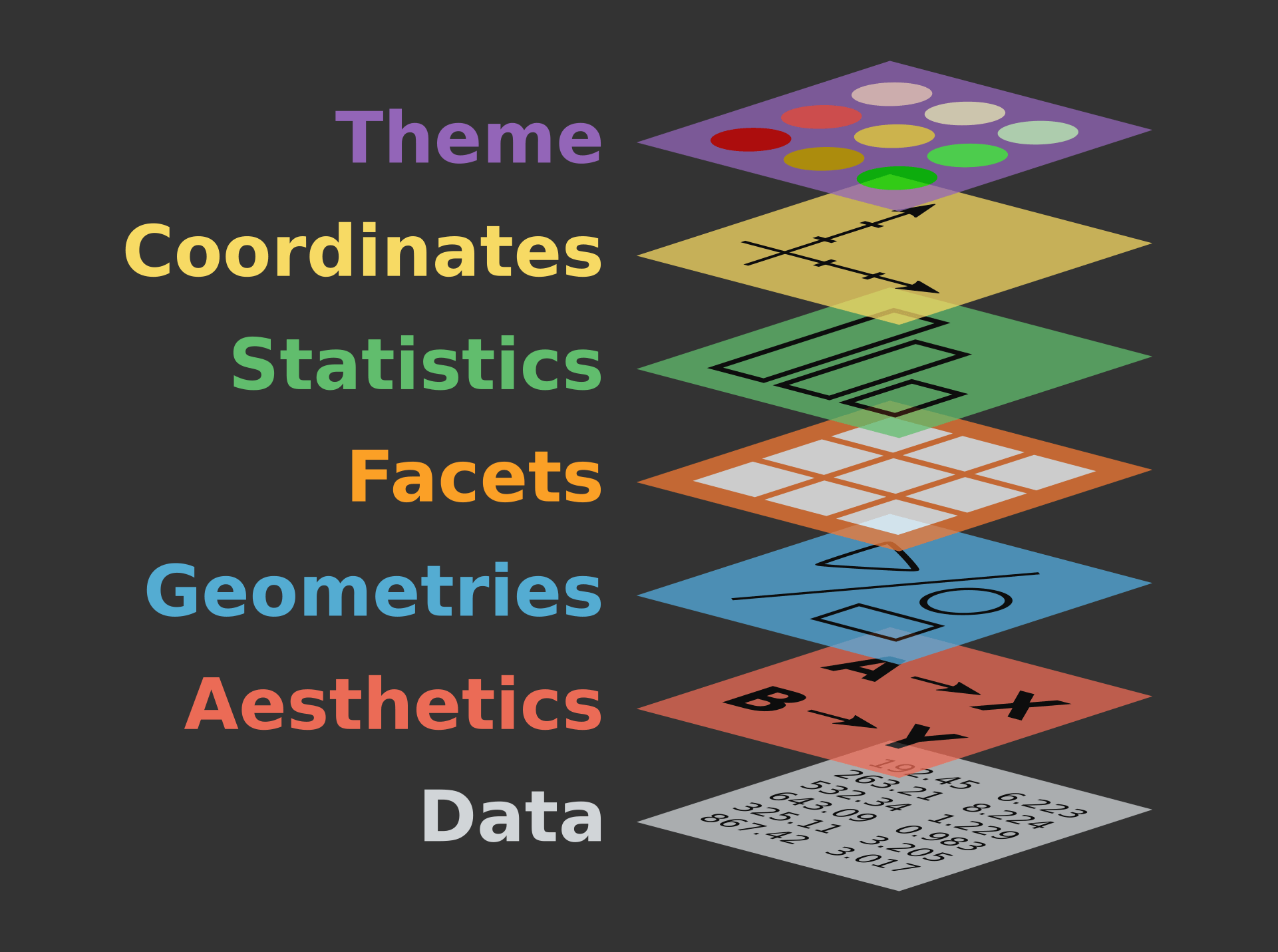
The grammar of graphics with ggplot2

Exercise 1
The basic ggplot (review from last time!)

penguins dataframe in palmerpenguins package
Today’s data: ratings
Subjective frequency ratings, ratings of estimated weight, and ratings of estimated size, averaged over subjects, for 81 concrete English nouns. – languageR
'data.frame':   81 obs. of  14 variables:
 $ Word            : Factor w/ 81 levels "almond","ant",..: 1 2 3 4 5 6 7 8 9 10 ...
 $ Frequency       : num  4.2 5.35 6.3 3.83 3.66 ...
 $ FamilySize      : num  0 1.39 1.1 0 0 ...
 $ SynsetCount     : num  1.1 1.1 1.1 1.39 1.1 ...
 $ Length          : int  6 3 5 7 9 7 6 6 3 6 ...
 $ Class           : Factor w/ 2 levels "animal","plant": 2 1 2 2 2 2 1 2 1 1 ...
 $ FreqSingular    : int  24 69 315 26 19 24 53 74 155 37 ...
 $ FreqPlural      : int  42 140 231 19 19 6 78 77 103 14 ...
 $ DerivEntropy    : num  0 0.562 0.496 0 0 ...
 $ Complex         : Factor w/ 2 levels "complex","simplex": 2 2 2 2 2 2 2 2 2 2 ...
 $ rInfl           : num  -0.542 -0.7 0.309 0.3 0 ...
 $ meanWeightRating: num  1.49 3.35 2.19 1.32 1.44 ...
 $ meanSizeRating  : num  1.89 3.63 2.47 1.76 1.87 ...
 $ meanFamiliarity : num  3.72 3.6 5.84 4.4 3.68 4.12 2.12 5.68 3.2 2.2 ...
Today’s data: ratings
We will make use of the following variables:
Frequency- actual word frequencymeanFamiliarity- subjective frequency ratingClass- whether word is a plant or animal
         Word Frequency  Class
1      almond  4.204693  plant
2         ant  5.347108 animal
3       apple  6.304449  plant
4     apricot  3.828641  plant
5   asparagus  3.663562  plant
6     avocado  3.433987  plant
7      badger  5.056246 animal
8      banana  5.023881  plant
9         bat  5.918894 animal
10     beaver  3.951244 animal
11        bee  5.700444 animal
12   beetroot  3.555348  plant
13 blackberry  4.060443  plant
14  blueberry  2.484907  plant
15   broccoli  2.833213  plant
16      bunny  3.332205 animal
17  butterfly  5.214936 animal
18      camel  6.109248 animal
19     carrot  4.976734  plant
20        cat  7.086738 animal
21     cherry  4.997212  plant
22    chicken  6.599870 animal
23      clove  3.663562  plant
24  crocodile  4.615121 animal
25   cucumber  4.454347  plant
26        dog  7.667626 animal
27    dolphin  4.007333 animal
28     donkey  5.541264 animal
29      eagle  5.117994 animal
30   eggplant  1.791759  plant
31   elephant  6.063785 animal
32        fox  5.652489 animal
33       frog  5.129899 animal
34    gherkin  2.079442  plant
35       goat  6.228511 animal
36      goose  5.267858 animal
37      grape  5.192957  plant
38       gull  4.418841 animal
39   hedgehog  3.637586 animal
40      horse  7.771910 animal
41       kiwi  3.044522  plant
42       leek  3.332205  plant
43      lemon  5.631212  plant
44    lettuce  4.812184  plant
45       lion  6.098074 animal
46     magpie  2.995732 animal
47      melon  4.127134  plant
48       mole  4.605170 animal
49     monkey  5.783825 animal
50      moose  2.708050 animal
51      mouse  5.805135 animal
52   mushroom  5.537334  plant
53    mustard  4.442651  plant
54      olive  5.587249  plant
55     orange  6.378426  plant
56        owl  4.859812 animal
57    paprika  2.484907  plant
58     peanut  4.595120  plant
59       pear  4.727388  plant
60        pig  6.660575 animal
61     pigeon  5.262690 animal
62  pineapple  3.988984  plant
63     potato  6.461468  plant
64     radish  3.044522  plant
65   reindeer  4.043051 animal
66      shark  5.880533 animal
67      sheep  6.577861 animal
68      snake  6.120297 animal
69     spider  4.844187 animal
70      squid  3.970292 animal
71   squirrel  4.709530 animal
72      stork  3.044522 animal
73 strawberry  4.753590  plant
74       swan  4.962845 animal
75     tomato  5.545177  plant
76   tortoise  4.624973 animal
77    vulture  4.248495 animal
78     walnut  4.499810  plant
79       wasp  4.682131 animal
80      whale  5.298317 animal
81 woodpecker  2.890372 animal
Geometric objects
geom_*() aka geoms
There are many. We will start with these, and add a few additional geoms as we move through the course:
geom_histogram() |
histogram, distribution of a continuous variable |
geom_density() |
distribution of a continuous variable |
geom_bar() |
distribution of a categorical data |
geom_point() |
scatterplot |
geom_smooth() |
smoothed line of best fit |
geom_histogram()
A histogram divides the x-axis into equally spaced bins and then uses the height of a bar to display the number of observations that fall in each bin. – R4DS
geom_histogram()
bins - How many bins should we have?
geom_histogram()
binwidth - How wide should the bins be?
geom_histogram()
color - What should the outline color be?
geom_histogram()
fill - What should the fill color be?
geom_density()
Imagine a histogram made out of wooden blocks. Then, imagine that you drop a cooked spaghetti string over it. The shape the spaghetti will take draped over blocks can be thought of as the shape of the density curve. – R4DS
geom_density()
Map Class to color aesthetic
geom_density()
Set linewidth
geom_density()
Map Class to fill and set alpha
geom_bar()
To examine the distribution of a categorical variable, you can use a bar chart. The height of the bars displays how many observations occurred with each x value. – R4DS
geom_bar() - stacked
We can use stacked bar plots to visualize the relationship between two categorical variables
geom_bar() - relative frequency
We can use relative frequency to visualize the relationship between two categorical variables (as a percentage)
geom_bar() - dodged
We can use a dodged bar plot to visualize the relationship between two categorical variables side-by-side, not stacked
geom_point()
Scatterplots are useful for displaying the relationship between two numerical variables – R4DS
ggplot(
    data = ratings,
    mapping = aes(
        x = Frequency,
        y = meanFamiliarity
    )
 ) +
  geom_point(
    color = "blue",
    size = 3
    ) +
  labs(
    title = "Subjective frequency ratings",
    subtitle = "for 81 english nouns",
    x = "Actual frequency",
    y = "Frequency rating",
    color = "word class"
  ) +
theme_classic(base_size = 20) 
geom_point() with geom_smooth()
draws a best fitting curve
ggplot(
    data = ratings,
    mapping = aes(
        x = Frequency,
        y = meanFamiliarity
    )
 ) +
  geom_point(
    color = "blue",
    size = 3
    ) +
  geom_smooth() +
  labs(
    title = "Subjective frequency ratings",
    subtitle = "for 81 english nouns",
    x = "Actual frequency",
    y = "Frequency rating",
    color = "word class"
  ) +
theme_classic(base_size = 20) 
geom_point() with geom_smooth(method="lm")
draws the best fitting linear model
ggplot(
    data = ratings,
    mapping = aes(
        x = Frequency,
        y = meanFamiliarity
    )
 ) +
  geom_point(
    color = "blue",
    size = 3
    ) +
  geom_smooth(method="lm") +
  labs(
    title = "Subjective frequency ratings",
    subtitle = "for 81 english nouns",
    x = "Actual frequency",
    y = "Frequency rating",
    color = "word class"
  ) +
theme_classic(base_size = 20) 
geom_point() with geom_smooth(method="lm")
We can also map to color, by specifying globally
ggplot(
    data = ratings,
    mapping = aes(
        x = Frequency,
        y = meanFamiliarity,
        color = Class
    )
 ) +
  geom_point(
    size = 3
    ) +
  geom_smooth(method="lm") +
  labs(
    title = "Subjective frequency ratings",
    subtitle = "for 81 english nouns",
    x = "Actual frequency",
    y = "Frequency rating",
    color = "word class"
  ) +
theme_classic(base_size = 20) 
geom_point() with geom_smooth(method="lm")
Or include only a single smooth, by specifying color in the point geom only
ggplot(
    data = ratings,
    mapping = aes(
        x = Frequency,
        y = meanFamiliarity
    )
 ) +
  geom_point(
    aes(color = Class),
    size = 3
    ) +
  geom_smooth(method="lm") +
  labs(
    title = "Subjective frequency ratings",
    subtitle = "for 81 english nouns",
    x = "Actual frequency",
    y = "Frequency rating",
    color = "word class"
  ) +
theme_classic(base_size = 20) 
Facets
smaller plots that display different subsets of data
facet_grid()

facet_grid() - just columns
facet_grid() - just columns
and note we can still map other aesthetics!
facet_grid() - just rows
facet_wrap()
facet_wrap() - number of columns
Helper functions
remember our goal plot?
ggplot(
    data = ratings,
    mapping = aes(
        x = Frequency,
        y = meanFamiliarity
    )
 ) +
  geom_point(
    mapping = aes(color = Class),
    size = 3
    ) +
  labs(
    title = "Subjective frequency ratings",
    subtitle = "for 81 english nouns",
    x = "Actual frequency",
    y = "Frequency rating",
    color = "word class"
  ) +
  theme_classic(base_size = 20) +
  scale_color_brewer(palette = "Paired")
last_plot()
returns the last plot

ggsave()
saves last plot
Themes
ggplot comes with many Complete themes
Default theme

Sample themes
Shortcuts
ggplot2 calls
the pipe %>%
the pipe takes the thing on its left and passes it along to the function on its right
the pipe %>%
the pipe takes the thing on its left and passes it along to the function on its right
x %>% f(y) is equivalent to f(x, y)
the pipe %>% and ggplot
Exercise 2
Practice adding aesthetics and layers by creating this!

Figure 2: Data from penguins dataframe in palmerpenguins package
Exercise 3
Need a challenge? Use the
datasaurus_dozendata from thedatasauRusR package to create this!


