library(tidyverse)
library(mosaic)Applied model specification
Now that we’ve covered the terminology and concepts, let’s apply model specification to some real models.
1 “Toy” data
Let’s start with the simplest possible example, a dataset with two data points. Suppose you record how many days you study over the next 5 days. On day 1, you study for 2 hours. On day 2, you study for 6 hours and so on. Your dataset might look something like this.
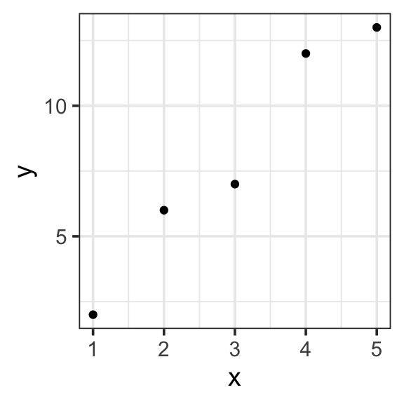
| x | y |
|---|---|
| 1 | 2 |
| 2 | 6 |
| 3 | 7 |
| 4 | 12 |
| 5 | 13 |
toy_data <- tibble(
  x = c(1, 2, 3, 4, 5),
  y = c(2, 6, 7, 12, 13)
)

toy_data %>%
  ggplot(aes(x = x, y = y)) +
  geom_point() +
theme_bw(base_size = 14) - Specify our response variable, \(y\): the response variable (🥸 data, output, prediction) is the variable you are trying to predict or explain with your model.
y
- Specify explantory variables, \(x_i\): the explanatory variables (🥸 regressors, inputs, predictors) are the predictors in your data that could help explain the response variable. Our data has only one possible:
x
- Specify the functional form: the functional form describes the relationship between the response and explanatory variables with a mathematical expresson. In a linear model, we express this relationship as a weighted sum of inputs:
- \(y=\sum_{i=1}^{n}w_ix_i\)
- Specify model terms: here we need to specify exactly how to express our explanatory variables in our functional form. The actual variables and constants that will be included in the model. There are four kinds of terms: (1) intercept, (2) main, (3) interaction, and (4) transformation. Here we have the simplest case of an intercept and one main term (no interactions or transformations necessary)
- \(y = w_1\mathbf{1} + w_2x_2\)
- in R:
y ~ 1 + x
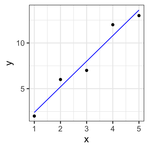
Model specification:
\(y = w_1\cdot\mathbf{1} + w_2\cdot\mathbf{x}\)
Call:
lm(formula = y ~ 1 + x, data = toy_data)

Coefficients:
(Intercept)            x
       -0.4          2.8
Fitted model:
\(y = -0.4\cdot1 + 2.8\cdot x\)
| x | y | with_formula | with_predict |
|---|---|---|---|
| 1 | 2 | 2.4 | 2.4 |
| 2 | 6 | 5.2 | 5.2 |
| 3 | 7 | 8.0 | 8.0 |
| 4 | 12 | 10.8 | 10.8 |
| 5 | 13 | 13.6 | 13.6 |
model <- lm(y ~ 1 + x, data = toy_data)

toy_data <- toy_data %>%
  mutate(with_formula = -0.4*1 + 2.8*x) %>%
  mutate(with_predict= predict(model, toy_data))

toy_data %>%
  ggplot(aes(x = x, y = y)) +
  geom_point() +
  geom_line(aes(y = with_predict), color = "blue") +
  theme_bw(base_size = 14)
2 Swim records
2.1 One input
If our model has a single input, it is likely the intercept term, a constant (not variable) capturing the typical value of the response variable when all explanatory variables are zero.
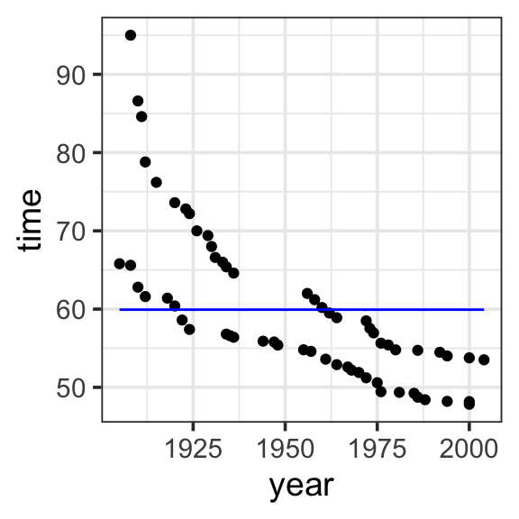
Model specification:
\(y = w_1\cdot\mathbf{1}\)
Call:
lm(formula = time ~ 1, data = SwimRecords)

Coefficients:
(Intercept)
      59.92
Fitted model:
\(y = 59.92 \cdot 1\)
| year | time | sex | with_formula | with_predict |
|---|---|---|---|---|
| 1905 | 65.80 | M | 59.92 | 59.92419 |
| 1908 | 65.60 | M | 59.92 | 59.92419 |
| 1910 | 62.80 | M | 59.92 | 59.92419 |
| 1912 | 61.60 | M | 59.92 | 59.92419 |
| 1918 | 61.40 | M | 59.92 | 59.92419 |
| 1920 | 60.40 | M | 59.92 | 59.92419 |
| 1922 | 58.60 | M | 59.92 | 59.92419 |
| 1924 | 57.40 | M | 59.92 | 59.92419 |
| 1934 | 56.80 | M | 59.92 | 59.92419 |
| 1935 | 56.60 | M | 59.92 | 59.92419 |
| 1936 | 56.40 | M | 59.92 | 59.92419 |
| 1944 | 55.90 | M | 59.92 | 59.92419 |
| 1947 | 55.80 | M | 59.92 | 59.92419 |
| 1948 | 55.40 | M | 59.92 | 59.92419 |
| 1955 | 54.80 | M | 59.92 | 59.92419 |
| 1957 | 54.60 | M | 59.92 | 59.92419 |
| 1961 | 53.60 | M | 59.92 | 59.92419 |
| 1964 | 52.90 | M | 59.92 | 59.92419 |
| 1967 | 52.60 | M | 59.92 | 59.92419 |
| 1968 | 52.20 | M | 59.92 | 59.92419 |
| 1970 | 51.90 | M | 59.92 | 59.92419 |
| 1972 | 51.22 | M | 59.92 | 59.92419 |
| 1975 | 50.59 | M | 59.92 | 59.92419 |
| 1976 | 49.44 | M | 59.92 | 59.92419 |
| 1981 | 49.36 | M | 59.92 | 59.92419 |
| 1985 | 49.24 | M | 59.92 | 59.92419 |
| 1986 | 48.74 | M | 59.92 | 59.92419 |
| 1988 | 48.42 | M | 59.92 | 59.92419 |
| 1994 | 48.21 | M | 59.92 | 59.92419 |
| 2000 | 48.18 | M | 59.92 | 59.92419 |
| 2000 | 47.84 | M | 59.92 | 59.92419 |
| 1908 | 95.00 | F | 59.92 | 59.92419 |
| 1910 | 86.60 | F | 59.92 | 59.92419 |
| 1911 | 84.60 | F | 59.92 | 59.92419 |
| 1912 | 78.80 | F | 59.92 | 59.92419 |
| 1915 | 76.20 | F | 59.92 | 59.92419 |
| 1920 | 73.60 | F | 59.92 | 59.92419 |
| 1923 | 72.80 | F | 59.92 | 59.92419 |
| 1924 | 72.20 | F | 59.92 | 59.92419 |
| 1926 | 70.00 | F | 59.92 | 59.92419 |
| 1929 | 69.40 | F | 59.92 | 59.92419 |
| 1930 | 68.00 | F | 59.92 | 59.92419 |
| 1931 | 66.60 | F | 59.92 | 59.92419 |
| 1933 | 66.00 | F | 59.92 | 59.92419 |
| 1934 | 65.40 | F | 59.92 | 59.92419 |
| 1936 | 64.60 | F | 59.92 | 59.92419 |
| 1956 | 62.00 | F | 59.92 | 59.92419 |
| 1958 | 61.20 | F | 59.92 | 59.92419 |
| 1960 | 60.20 | F | 59.92 | 59.92419 |
| 1962 | 59.50 | F | 59.92 | 59.92419 |
| 1964 | 58.90 | F | 59.92 | 59.92419 |
| 1972 | 58.50 | F | 59.92 | 59.92419 |
| 1973 | 57.54 | F | 59.92 | 59.92419 |
| 1974 | 56.96 | F | 59.92 | 59.92419 |
| 1976 | 55.65 | F | 59.92 | 59.92419 |
| 1978 | 55.41 | F | 59.92 | 59.92419 |
| 1980 | 54.79 | F | 59.92 | 59.92419 |
| 1986 | 54.73 | F | 59.92 | 59.92419 |
| 1992 | 54.48 | F | 59.92 | 59.92419 |
| 1994 | 54.01 | F | 59.92 | 59.92419 |
| 2000 | 53.77 | F | 59.92 | 59.92419 |
| 2004 | 53.52 | F | 59.92 | 59.92419 |
model <- lm(time ~ 1, data = SwimRecords)

SwimRecords_predict <- SwimRecords %>%
  mutate(with_formula = 59.92*1) %>%
  mutate(with_predict= predict(model, SwimRecords))

SwimRecords_predict %>%
  ggplot(aes(x = year, y = time)) +
  geom_point() +
  geom_line(aes(y = with_predict), color = "blue") +
  theme_bw(base_size = 14)
2.2 Two inputs
We can add another term to our model represnting the effect of year on record time. This is a main term or main effect, which represents the effect of each explanatory variable on the response variable directly. In other words, how does record time change as a result of changes in year, when all other explanatory variables are zero?
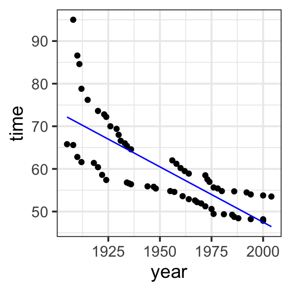
Model specification:
\(y = w_1\cdot\mathbf{1} + w_2\cdot\mathbf{year}\)
Call:
lm(formula = time ~ 1 + year, data = SwimRecords)

Coefficients:
(Intercept)         year
   567.2420      -0.2599
Fitted model:
\(y = 567.2420 \cdot \mathbf{1} + -0.2599 \cdot \mathbf{year}\)
| year | time | sex | with_formula | with_predict |
|---|---|---|---|---|
| 1905 | 65.80 | M | 72.1325 | 72.17614 |
| 1908 | 65.60 | M | 71.3528 | 71.39651 |
| 1910 | 62.80 | M | 70.8330 | 70.87676 |
| 1912 | 61.60 | M | 70.3132 | 70.35700 |
| 1918 | 61.40 | M | 68.7538 | 68.79774 |
| 1920 | 60.40 | M | 68.2340 | 68.27798 |
| 1922 | 58.60 | M | 67.7142 | 67.75823 |
| 1924 | 57.40 | M | 67.1944 | 67.23848 |
| 1934 | 56.80 | M | 64.5954 | 64.63971 |
| 1935 | 56.60 | M | 64.3355 | 64.37983 |
| 1936 | 56.40 | M | 64.0756 | 64.11995 |
| 1944 | 55.90 | M | 61.9964 | 62.04093 |
| 1947 | 55.80 | M | 61.2167 | 61.26130 |
| 1948 | 55.40 | M | 60.9568 | 61.00143 |
| 1955 | 54.80 | M | 59.1375 | 59.18229 |
| 1957 | 54.60 | M | 58.6177 | 58.66253 |
| 1961 | 53.60 | M | 57.5781 | 57.62302 |
| 1964 | 52.90 | M | 56.7984 | 56.84339 |
| 1967 | 52.60 | M | 56.0187 | 56.06376 |
| 1968 | 52.20 | M | 55.7588 | 55.80388 |
| 1970 | 51.90 | M | 55.2390 | 55.28413 |
| 1972 | 51.22 | M | 54.7192 | 54.76438 |
| 1975 | 50.59 | M | 53.9395 | 53.98474 |
| 1976 | 49.44 | M | 53.6796 | 53.72487 |
| 1981 | 49.36 | M | 52.3801 | 52.42548 |
| 1985 | 49.24 | M | 51.3405 | 51.38597 |
| 1986 | 48.74 | M | 51.0806 | 51.12610 |
| 1988 | 48.42 | M | 50.5608 | 50.60634 |
| 1994 | 48.21 | M | 49.0014 | 49.04708 |
| 2000 | 48.18 | M | 47.4420 | 47.48782 |
| 2000 | 47.84 | M | 47.4420 | 47.48782 |
| 1908 | 95.00 | F | 71.3528 | 71.39651 |
| 1910 | 86.60 | F | 70.8330 | 70.87676 |
| 1911 | 84.60 | F | 70.5731 | 70.61688 |
| 1912 | 78.80 | F | 70.3132 | 70.35700 |
| 1915 | 76.20 | F | 69.5335 | 69.57737 |
| 1920 | 73.60 | F | 68.2340 | 68.27798 |
| 1923 | 72.80 | F | 67.4543 | 67.49835 |
| 1924 | 72.20 | F | 67.1944 | 67.23848 |
| 1926 | 70.00 | F | 66.6746 | 66.71872 |
| 1929 | 69.40 | F | 65.8949 | 65.93909 |
| 1930 | 68.00 | F | 65.6350 | 65.67921 |
| 1931 | 66.60 | F | 65.3751 | 65.41934 |
| 1933 | 66.00 | F | 64.8553 | 64.89958 |
| 1934 | 65.40 | F | 64.5954 | 64.63971 |
| 1936 | 64.60 | F | 64.0756 | 64.11995 |
| 1956 | 62.00 | F | 58.8776 | 58.92241 |
| 1958 | 61.20 | F | 58.3578 | 58.40266 |
| 1960 | 60.20 | F | 57.8380 | 57.88290 |
| 1962 | 59.50 | F | 57.3182 | 57.36315 |
| 1964 | 58.90 | F | 56.7984 | 56.84339 |
| 1972 | 58.50 | F | 54.7192 | 54.76438 |
| 1973 | 57.54 | F | 54.4593 | 54.50450 |
| 1974 | 56.96 | F | 54.1994 | 54.24462 |
| 1976 | 55.65 | F | 53.6796 | 53.72487 |
| 1978 | 55.41 | F | 53.1598 | 53.20511 |
| 1980 | 54.79 | F | 52.6400 | 52.68536 |
| 1986 | 54.73 | F | 51.0806 | 51.12610 |
| 1992 | 54.48 | F | 49.5212 | 49.56683 |
| 1994 | 54.01 | F | 49.0014 | 49.04708 |
| 2000 | 53.77 | F | 47.4420 | 47.48782 |
| 2004 | 53.52 | F | 46.4024 | 46.44831 |
model <- lm(time ~ 1 + year, data = SwimRecords)

SwimRecords_predict <- SwimRecords %>%
  mutate(with_formula = 567.2420*1 + -0.2599*year) %>%
  mutate(with_predict= predict(model, SwimRecords))

SwimRecords_predict %>%
  ggplot(aes(x = year, y = time)) +
  geom_point() +
  geom_line(aes(y = with_predict), color = "blue") +
  theme_bw(base_size = 14)
2.3 Three inputs
We can see that the previous model allowed us to capture the effect of year on record time, but we still have some unexplained variation. We can include sex in the model to capture the difference in record times by sex.
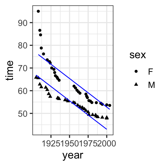
Model specification:
\(y = w_1\cdot\mathbf{1} + w_2\cdot\mathbf{year} + w_3\cdot\mathbf{sex}\)
Call:
lm(formula = time ~ 1 + year + sex, data = SwimRecords)

Coefficients:
(Intercept)         year         sexM
   555.7168      -0.2515      -9.7980
Fitted model:
\(y = 555.7168 \cdot \mathbf{1} + -0.2515 \cdot \mathbf{year} + -9.7980 \cdot \mathbf{sex}\)
| year | time | sex | sex_numeric | with_formula | with_predict |
|---|---|---|---|---|---|
| 1905 | 65.80 | M | 1 | 66.8113 | 66.88051 |
| 1908 | 65.60 | M | 1 | 66.0568 | 66.12612 |
| 1910 | 62.80 | M | 1 | 65.5538 | 65.62319 |
| 1912 | 61.60 | M | 1 | 65.0508 | 65.12026 |
| 1918 | 61.40 | M | 1 | 63.5418 | 63.61148 |
| 1920 | 60.40 | M | 1 | 63.0388 | 63.10855 |
| 1922 | 58.60 | M | 1 | 62.5358 | 62.60563 |
| 1924 | 57.40 | M | 1 | 62.0328 | 62.10270 |
| 1934 | 56.80 | M | 1 | 59.5178 | 59.58806 |
| 1935 | 56.60 | M | 1 | 59.2663 | 59.33660 |
| 1936 | 56.40 | M | 1 | 59.0148 | 59.08513 |
| 1944 | 55.90 | M | 1 | 57.0028 | 57.07343 |
| 1947 | 55.80 | M | 1 | 56.2483 | 56.31903 |
| 1948 | 55.40 | M | 1 | 55.9968 | 56.06757 |
| 1955 | 54.80 | M | 1 | 54.2363 | 54.30732 |
| 1957 | 54.60 | M | 1 | 53.7333 | 53.80440 |
| 1961 | 53.60 | M | 1 | 52.7273 | 52.79854 |
| 1964 | 52.90 | M | 1 | 51.9728 | 52.04415 |
| 1967 | 52.60 | M | 1 | 51.2183 | 51.28976 |
| 1968 | 52.20 | M | 1 | 50.9668 | 51.03830 |
| 1970 | 51.90 | M | 1 | 50.4638 | 50.53537 |
| 1972 | 51.22 | M | 1 | 49.9608 | 50.03244 |
| 1975 | 50.59 | M | 1 | 49.2063 | 49.27805 |
| 1976 | 49.44 | M | 1 | 48.9548 | 49.02659 |
| 1981 | 49.36 | M | 1 | 47.6973 | 47.76927 |
| 1985 | 49.24 | M | 1 | 46.6913 | 46.76341 |
| 1986 | 48.74 | M | 1 | 46.4398 | 46.51195 |
| 1988 | 48.42 | M | 1 | 45.9368 | 46.00902 |
| 1994 | 48.21 | M | 1 | 44.4278 | 44.50024 |
| 2000 | 48.18 | M | 1 | 42.9188 | 42.99146 |
| 2000 | 47.84 | M | 1 | 42.9188 | 42.99146 |
| 1908 | 95.00 | F | 0 | 75.8548 | 75.92408 |
| 1910 | 86.60 | F | 0 | 75.3518 | 75.42115 |
| 1911 | 84.60 | F | 0 | 75.1003 | 75.16969 |
| 1912 | 78.80 | F | 0 | 74.8488 | 74.91822 |
| 1915 | 76.20 | F | 0 | 74.0943 | 74.16383 |
| 1920 | 73.60 | F | 0 | 72.8368 | 72.90651 |
| 1923 | 72.80 | F | 0 | 72.0823 | 72.15212 |
| 1924 | 72.20 | F | 0 | 71.8308 | 71.90066 |
| 1926 | 70.00 | F | 0 | 71.3278 | 71.39773 |
| 1929 | 69.40 | F | 0 | 70.5733 | 70.64334 |
| 1930 | 68.00 | F | 0 | 70.3218 | 70.39188 |
| 1931 | 66.60 | F | 0 | 70.0703 | 70.14041 |
| 1933 | 66.00 | F | 0 | 69.5673 | 69.63749 |
| 1934 | 65.40 | F | 0 | 69.3158 | 69.38602 |
| 1936 | 64.60 | F | 0 | 68.8128 | 68.88310 |
| 1956 | 62.00 | F | 0 | 63.7828 | 63.85382 |
| 1958 | 61.20 | F | 0 | 63.2798 | 63.35090 |
| 1960 | 60.20 | F | 0 | 62.7768 | 62.84797 |
| 1962 | 59.50 | F | 0 | 62.2738 | 62.34504 |
| 1964 | 58.90 | F | 0 | 61.7708 | 61.84211 |
| 1972 | 58.50 | F | 0 | 59.7588 | 59.83040 |
| 1973 | 57.54 | F | 0 | 59.5073 | 59.57894 |
| 1974 | 56.96 | F | 0 | 59.2558 | 59.32748 |
| 1976 | 55.65 | F | 0 | 58.7528 | 58.82455 |
| 1978 | 55.41 | F | 0 | 58.2498 | 58.32162 |
| 1980 | 54.79 | F | 0 | 57.7468 | 57.81869 |
| 1986 | 54.73 | F | 0 | 56.2378 | 56.30991 |
| 1992 | 54.48 | F | 0 | 54.7288 | 54.80113 |
| 1994 | 54.01 | F | 0 | 54.2258 | 54.29820 |
| 2000 | 53.77 | F | 0 | 52.7168 | 52.78942 |
| 2004 | 53.52 | F | 0 | 51.7108 | 51.78357 |
model <- lm(time ~ 1 + year + sex, data = SwimRecords)

SwimRecords_predict <- SwimRecords %>%
  mutate(sex_numeric = case_when(
    sex == 'M' ~ 1,
    sex == 'F' ~ 0
  )) %>%
  mutate(with_formula = 555.7168*1 + -0.2515*year + -9.7980 *sex_numeric) %>%
  mutate(with_predict= predict(model, SwimRecords))

SwimRecords_predict %>%
  ggplot(aes(x = year, y = time, shape = sex)) +
  geom_point() +
  geom_line(aes(y = with_predict), color = "blue") +
  theme_bw(base_size = 14)
2.4 Interaction
Notice that the previous model now gets us record times getting faster by year, and different predictions for men and women (women have slower times). But this is missing another relationship we can see in our data: that women are getting faster, faster. To express that the effect of one explanatory variable on the response variable is different at different values of another explanatory variable (e.g. the effect of year on record times is different for men and women), we add a term to the model in which we multiply the values of the interacting variables.
We could say that we “expand the input space” of the model, since we add terms to capture the interaction
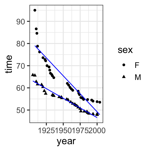
Model specification:
\(y = w_1\cdot\mathbf{1} + w_2\cdot\mathbf{year} + w_3\cdot\mathbf{sex} + w_4\cdot\mathbf{year\times{sex}}\)
Call:
lm(formula = time ~ 1 + year * sex, data = SwimRecords)

Coefficients:
(Intercept)         year         sexM    year:sexM
   697.3012      -0.3240    -302.4638       0.1499
Fitted model:
\[\begin{align}
y = &697.3012 \cdot \mathbf{1} + -0.3240 \cdot \mathbf{year} + -302.4638 \cdot \mathbf{sex}\\
&+ 0.1499 \cdot \mathbf{year\times{sex}}
\end{align}\]
| year | time | sex | with_predict |
|---|---|---|---|
| 1905 | 65.80 | M | 63.12106 |
| 1908 | 65.60 | M | 62.59867 |
| 1910 | 62.80 | M | 62.25041 |
| 1912 | 61.60 | M | 61.90215 |
| 1918 | 61.40 | M | 60.85738 |
| 1920 | 60.40 | M | 60.50912 |
| 1922 | 58.60 | M | 60.16086 |
| 1924 | 57.40 | M | 59.81260 |
| 1934 | 56.80 | M | 58.07131 |
| 1935 | 56.60 | M | 57.89718 |
| 1936 | 56.40 | M | 57.72305 |
| 1944 | 55.90 | M | 56.33002 |
| 1947 | 55.80 | M | 55.80763 |
| 1948 | 55.40 | M | 55.63350 |
| 1955 | 54.80 | M | 54.41459 |
| 1957 | 54.60 | M | 54.06634 |
| 1961 | 53.60 | M | 53.36982 |
| 1964 | 52.90 | M | 52.84743 |
| 1967 | 52.60 | M | 52.32504 |
| 1968 | 52.20 | M | 52.15091 |
| 1970 | 51.90 | M | 51.80266 |
| 1972 | 51.22 | M | 51.45440 |
| 1975 | 50.59 | M | 50.93201 |
| 1976 | 49.44 | M | 50.75788 |
| 1981 | 49.36 | M | 49.88723 |
| 1985 | 49.24 | M | 49.19072 |
| 1986 | 48.74 | M | 49.01659 |
| 1988 | 48.42 | M | 48.66833 |
| 1994 | 48.21 | M | 47.62355 |
| 2000 | 48.18 | M | 46.57878 |
| 2000 | 47.84 | M | 46.57878 |
| 1908 | 95.00 | F | 79.02170 |
| 1910 | 86.60 | F | 78.37361 |
| 1911 | 84.60 | F | 78.04956 |
| 1912 | 78.80 | F | 77.72552 |
| 1915 | 76.20 | F | 76.75338 |
| 1920 | 73.60 | F | 75.13315 |
| 1923 | 72.80 | F | 74.16101 |
| 1924 | 72.20 | F | 73.83697 |
| 1926 | 70.00 | F | 73.18887 |
| 1929 | 69.40 | F | 72.21674 |
| 1930 | 68.00 | F | 71.89269 |
| 1931 | 66.60 | F | 71.56864 |
| 1933 | 66.00 | F | 70.92055 |
| 1934 | 65.40 | F | 70.59651 |
| 1936 | 64.60 | F | 69.94842 |
| 1956 | 62.00 | F | 63.46750 |
| 1958 | 61.20 | F | 62.81941 |
| 1960 | 60.20 | F | 62.17131 |
| 1962 | 59.50 | F | 61.52322 |
| 1964 | 58.90 | F | 60.87513 |
| 1972 | 58.50 | F | 58.28276 |
| 1973 | 57.54 | F | 57.95872 |
| 1974 | 56.96 | F | 57.63467 |
| 1976 | 55.65 | F | 56.98658 |
| 1978 | 55.41 | F | 56.33849 |
| 1980 | 54.79 | F | 55.69040 |
| 1986 | 54.73 | F | 53.74612 |
| 1992 | 54.48 | F | 51.80185 |
| 1994 | 54.01 | F | 51.15375 |
| 2000 | 53.77 | F | 49.20948 |
| 2004 | 53.52 | F | 47.91330 |
model <- lm(time ~ 1 + year * sex, data = SwimRecords)

SwimRecords_predict <- SwimRecords %>%
  mutate(with_predict= predict(model, SwimRecords))

SwimRecords_predict %>%
  ggplot(aes(x = year, y = time, shape = sex)) +
  geom_point() +
  geom_line(aes(y = with_predict), color = "blue") +
  theme_bw(base_size = 14)
2.5 Transformation
Now our model is doing a great job at predicting our data, but there may be more we want to do. For example, we can see that the model is not predicting women very well around the year 2000 (it is predicting they will be faster than they are). If we want to allow the model to have a curve shape, capturing that women gained on men for a while, but are no slowing down, we can add a term to the model in which we square the year. This allows us to capture this nonlinear curve or bend in the data (more on this for polynomials in the next section).
but notice that the model is fitting the data well, but still behaving a bit non-sensical toward the 2000s, predicint that record times are getter slower! Impossible!)
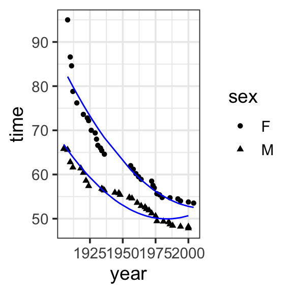
Model specification:
\[\begin{align}
y = &w_1\cdot\mathbf{1} + w_2\cdot\mathbf{year} + w_3\cdot\mathbf{sex} \\
&+ w_4\cdot\mathbf{year\times{sex}} +w_5\cdot\mathbf{year}^2
\end{align}\]
Call:
lm(formula = time ~ 1 + year * sex + I(year^2), data = SwimRecords)

Coefficients:
(Intercept)         year         sexM    I(year^2)    year:sexM
  1.110e+04   -1.098e+01   -3.171e+02    2.729e-03    1.575e-01
Fitted model:
\[\begin{align}
y = &11100 \cdot \mathbf{1} + -10.98 \cdot \mathbf{year} + -317.1 \cdot \mathbf{sex}\\
&+ 0.1575 \cdot \mathbf{year\times{sex}} + 0.002729 \cdot \mathbf{year}^2
\end{align}\]
| year | time | sex | with_predict |
|---|---|---|---|
| 1905 | 65.80 | M | 66.81874 |
| 1908 | 65.60 | M | 65.55576 |
| 1910 | 62.80 | M | 64.74106 |
| 1912 | 61.60 | M | 63.94819 |
| 1918 | 61.40 | M | 61.70057 |
| 1920 | 60.40 | M | 60.99502 |
| 1922 | 58.60 | M | 60.31130 |
| 1924 | 57.40 | M | 59.64941 |
| 1934 | 56.80 | M | 56.66741 |
| 1935 | 56.60 | M | 56.39922 |
| 1936 | 56.40 | M | 56.13650 |
| 1944 | 55.90 | M | 54.23115 |
| 1947 | 55.80 | M | 53.60669 |
| 1948 | 55.40 | M | 53.40946 |
| 1955 | 54.80 | M | 52.18160 |
| 1957 | 54.60 | M | 51.87991 |
| 1961 | 53.60 | M | 51.34200 |
| 1964 | 52.90 | M | 50.99587 |
| 1967 | 52.60 | M | 50.69886 |
| 1968 | 52.20 | M | 50.61078 |
| 1970 | 51.90 | M | 50.45097 |
| 1972 | 51.22 | M | 50.31300 |
| 1975 | 50.59 | M | 50.14697 |
| 1976 | 49.44 | M | 50.10254 |
| 1981 | 49.36 | M | 49.96226 |
| 1985 | 49.24 | M | 49.94827 |
| 1986 | 48.74 | M | 49.95841 |
| 1988 | 48.42 | M | 49.99508 |
| 1994 | 48.21 | M | 50.23605 |
| 2000 | 48.18 | M | 50.67349 |
| 2000 | 47.84 | M | 50.67349 |
| 1908 | 95.00 | F | 82.16082 |
| 1910 | 86.60 | F | 81.03116 |
| 1911 | 84.60 | F | 80.47451 |
| 1912 | 78.80 | F | 79.92332 |
| 1915 | 76.20 | F | 78.30250 |
| 1920 | 73.60 | F | 75.71028 |
| 1923 | 72.80 | F | 74.22044 |
| 1924 | 72.20 | F | 73.73474 |
| 1926 | 70.00 | F | 72.77971 |
| 1929 | 69.40 | F | 71.38810 |
| 1930 | 68.00 | F | 70.93515 |
| 1931 | 66.60 | F | 70.48765 |
| 1933 | 66.00 | F | 69.60903 |
| 1934 | 65.40 | F | 69.17790 |
| 1936 | 64.60 | F | 68.33203 |
| 1956 | 62.00 | F | 61.07389 |
| 1958 | 61.20 | F | 60.46814 |
| 1960 | 60.20 | F | 59.88422 |
| 1962 | 59.50 | F | 59.32213 |
| 1964 | 58.90 | F | 58.78187 |
| 1972 | 58.50 | F | 56.83913 |
| 1973 | 57.54 | F | 56.62085 |
| 1974 | 56.96 | F | 56.40802 |
| 1976 | 55.65 | F | 55.99874 |
| 1978 | 55.41 | F | 55.61129 |
| 1980 | 54.79 | F | 55.24567 |
| 1986 | 54.73 | F | 54.27978 |
| 1992 | 54.48 | F | 53.51036 |
| 1994 | 54.01 | F | 53.29755 |
| 2000 | 53.77 | F | 52.79009 |
| 2004 | 53.52 | F | 52.56093 |
model <- lm(time ~ 1 + year * sex + I(year^2), data = SwimRecords)

SwimRecords_predict <- SwimRecords %>%
  mutate(with_predict= predict(model, SwimRecords))

SwimRecords_predict %>%
  ggplot(aes(x = year, y = time, shape = sex)) +
  geom_point() +
  geom_line(aes(y = with_predict), color = "blue") +
  theme_bw(base_size = 14)
3 Linearizing nonlinear models
When you want to linearlize a nonlinear model, you’re trying to fit a linear model to data that doesn’t naturally follow a straight line. There are two common ways to approach this:
- Expanding the input space with polynomials. Polynomials can capture “bumps” or curves in the data. In this approach, we add terms to the model, like squares or cubes of the original variable.
- \(y = w_1 + w_2x + w_3x^2\)
- Transforming the data involves applying mathematical functions to existing inputs to alter their scale or distributions. Common transformations include taking the logarithm or square root. Taking the logarithm of a variable compresses its range and reduces skewness in the data (as in the brain size and body weight data).
- both output and input: \(log(y) = w_1 + w_2 log(x)\)
- just input: \(y = w_1 + w_2 log(x)\)
4 Plant heights (polynomials)
Polynomials capture “bumps” or curves in the data, and the number of these bumps depends on the degree of the polynomial. The higher the degree, the more complex the shape the polynomial can represent.
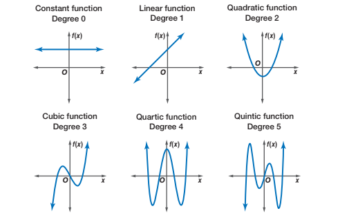
- Degree 1 (Linear): A straight line. There are no bumps or curves. The relationship between the predictor and the response is either increasing or decreasing at a constant rate.
- Degree 2 (Quadratic): A single bump or curve. The graph is either a U-shape (bowl) or an upside-down U-shape (hill), meaning it can capture one turning point.
- Degree 3 (Cubic): Can capture two bumps (or one “S” shaped curve). The graph can have two turning points, meaning it can start by increasing, then decrease, and increase again (or the opposite).
- Degree 4 (Quartic): Can capture three bumps or changes in direction. The graph can have up to three turning points, allowing for more complex shapes and curves in the data.
4.1 Degree 1 (Linear)
Remember, a Degree 1 (Linear) is a straight line. There are no bumps or curves. The relationship between the predictor and the response is either increasing or decreasing at a constant rate. This doesn’t seem to capture the relationship between light_exposure and plant_height in our data.
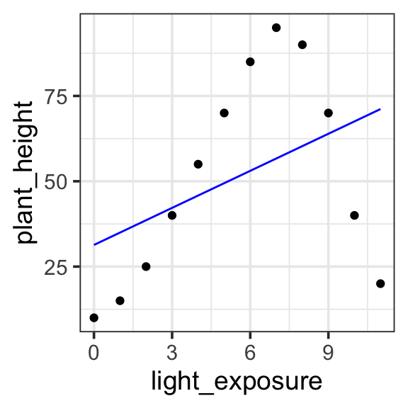
Model specification:
\(y = w_1\cdot\mathbf{1} + w_2 \cdot \mathbf{x}\)
Call:
lm(formula = plant_height ~ 1 + light_exposure, data = poly_plants)

Coefficients:
   (Intercept)  light_exposure
        31.346           3.619
Fitted model:
\(y = 31.346 \cdot 1 + 3.619 \cdot x\)
| plant | light_exposure | plant_height | with_formula | with_predict |
|---|---|---|---|---|
| Sunflower | 0 | 10 | 31.346 | 31.34615 |
| Sunflower | 1 | 15 | 34.965 | 34.96504 |
| Sunflower | 2 | 25 | 38.584 | 38.58392 |
| Rose | 3 | 40 | 42.203 | 42.20280 |
| Rose | 4 | 55 | 45.822 | 45.82168 |
| Rose | 5 | 70 | 49.441 | 49.44056 |
| Cactus | 6 | 85 | 53.060 | 53.05944 |
| Cactus | 7 | 95 | 56.679 | 56.67832 |
| Cactus | 8 | 90 | 60.298 | 60.29720 |
| Orchid | 9 | 70 | 63.917 | 63.91608 |
| Orchid | 10 | 40 | 67.536 | 67.53496 |
| Orchid | 11 | 20 | 71.155 | 71.15385 |
poly_plants <- read_csv('https://kathrynschuler.com/datasci/assests/csv/polynomial_plants.csv')

model <- lm(plant_height ~ 1 + light_exposure, data = poly_plants)

poly_plants <- poly_plants %>%
  mutate(with_formula = 31.346*1 + 3.619*light_exposure) %>%
  mutate(with_predict= predict(model, poly_plants))

poly_plants %>%
  ggplot(aes(x = light_exposure, y = plant_height)) +
  geom_point() +
  geom_line(aes(y = with_predict), color = "blue") +
  theme_bw(base_size = 14)
4.2 Degree 2 (Quadratic)
In a Degree 2 (Quadratic) polynomial, we can express a single bump or curve. The graph is either a U-shape (bowl) or an upside-down U-shape (hill), meaning it can capture one turning point. This provides a better fit for our data, allow us to express the light exposure goes up and then back down again. But it looks like there is another “bump” in the data, going back upward around light exposure of 1 or 2.
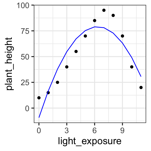
Model specification:
\(y = w_1\cdot\mathbf{1} + w_2 \cdot \mathbf{x} + w_3 \cdot \mathbf{x}^2\)
Call:
lm(formula = plant_height ~ 1 + light_exposure + I(light_exposure^2),
    data = poly_plants)

Coefficients:
        (Intercept)       light_exposure  I(light_exposure^2)
             -9.245               27.973               -2.214
Fitted model:
\(y = -9.245 \cdot\mathbf{1} + 27.973 \cdot \mathbf{x} + -2.214 \cdot \mathbf{x}^2\)
| plant | light_exposure | plant_height | with_predict |
|---|---|---|---|
| Sunflower | 0 | 10 | -9.244506 |
| Sunflower | 1 | 15 | 16.514735 |
| Sunflower | 2 | 25 | 37.845904 |
| Rose | 3 | 40 | 54.749001 |
| Rose | 4 | 55 | 67.224026 |
| Rose | 5 | 70 | 75.270979 |
| Cactus | 6 | 85 | 78.889860 |
| Cactus | 7 | 95 | 78.080669 |
| Cactus | 8 | 90 | 72.843407 |
| Orchid | 9 | 70 | 63.178072 |
| Orchid | 10 | 40 | 49.084665 |
| Orchid | 11 | 20 | 30.563187 |
model <- lm(plant_height ~ 1 + light_exposure + I(light_exposure^2), data = poly_plants)

poly_plants <- poly_plants %>%
  mutate(with_predict= predict(model, poly_plants))

poly_plants %>%
  ggplot(aes(x = light_exposure, y = plant_height)) +
  geom_point() +
  geom_line(aes(y = with_predict), color = "blue") +
  theme_bw(base_size = 14)
4.3 Degree 3 (Cubic)
In a Degree 3 (Cubic) polynomial, we can capture two bumps (or one “S” shaped curve). The graph can have two turning points, meaning it can start by increasing, then decrease, and increase again (or the opposite). This captures the data quite nicely.
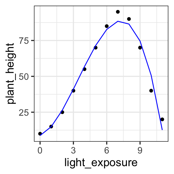
Model specification:
\(y = w_1\cdot\mathbf{1} + w_2 \cdot \mathbf{x} + w_3 \cdot \mathbf{x}^2 + w_4 \cdot \mathbf{x}^3\)
Call:
lm(formula = plant_height ~ 1 + light_exposure + I(light_exposure^2) +
    I(light_exposure^3), data = poly_plants)

Coefficients:
        (Intercept)       light_exposure  I(light_exposure^2)
             8.7363               2.7276               3.7796
I(light_exposure^3)
            -0.3632
Fitted model:
\(y = 8.7363 \cdot \mathbf{1} + 2.7276 \cdot \mathbf{x} + 3.7796 \cdot \mathbf{x}^2 + -0.3632 \cdot \mathbf{x}^3\)
| plant | light_exposure | plant_height | with_predict |
|---|---|---|---|
| Sunflower | 0 | 10 | 8.736264 |
| Sunflower | 1 | 15 | 14.880120 |
| Sunflower | 2 | 25 | 26.403596 |
| Rose | 3 | 40 | 41.127206 |
| Rose | 4 | 55 | 56.871462 |
| Rose | 5 | 70 | 71.456877 |
| Cactus | 6 | 85 | 82.703963 |
| Cactus | 7 | 95 | 88.433233 |
| Cactus | 8 | 90 | 86.465202 |
| Orchid | 9 | 70 | 74.620380 |
| Orchid | 10 | 40 | 50.719281 |
| Orchid | 11 | 20 | 12.582418 |
model <- lm(plant_height ~ 1 + light_exposure + I(light_exposure^2) + I(light_exposure^3), data = poly_plants)

poly_plants <- poly_plants %>%
  mutate(with_predict= predict(model, poly_plants))

poly_plants %>%
  ggplot(aes(x = light_exposure, y = plant_height)) +
  geom_point() +
  geom_line(aes(y = with_predict), color = "blue") +
  theme_bw(base_size = 14)
5 Brain size (log)
5.1 Untransformed
When we have a nonlinear relationship, as here, we could just try to fit a linear model to the untransformed data. It techincally works — there is no math reason that prevents us from fitting this model — but we can see that it is a very bad description of the data.
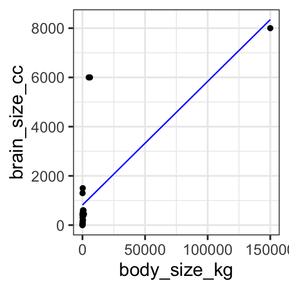
Model specification:
\(y = w_1\cdot\mathbf{1} + w_2\cdot\mathbf{body\_size\_kg}\)
Call:
lm(formula = brain_size_cc ~ 1 + body_size_kg, data = brain_data)

Coefficients:
 (Intercept)  body_size_kg
   816.59014       0.05021
Fitted model:
\(y = 816.59014 \cdot\mathbf{1} + 0.05021 \cdot\mathbf{body\_size\_kg}\)
| Species | brain_size_cc | body_size_kg | with_predict |
|---|---|---|---|
| Mouse | 0.4 | 2.0e-02 | 816.5911 |
| Rat | 2.0 | 2.5e-01 | 816.6027 |
| Rabbit | 12.0 | 1.5e+00 | 816.6655 |
| Cat | 25.0 | 4.5e+00 | 816.8161 |
| Dog | 50.0 | 1.0e+01 | 817.0923 |
| Sheep | 150.0 | 7.0e+01 | 820.1049 |
| Pig | 300.0 | 1.0e+02 | 821.6113 |
| Goat | 450.0 | 5.0e+01 | 819.1007 |
| Gorilla | 500.0 | 1.8e+02 | 825.6282 |
| Horse | 600.0 | 4.0e+02 | 836.6747 |
| Human | 1300.0 | 7.0e+01 | 820.1049 |
| Chimpanzee | 400.0 | 6.0e+01 | 819.6028 |
| Dolphin | 1500.0 | 2.0e+02 | 826.6324 |
| Whale (Orca) | 6000.0 | 5.0e+03 | 1067.6469 |
| Elephant | 6000.0 | 6.0e+03 | 1117.8583 |
| Blue Whale | 8000.0 | 1.5e+05 | 8348.2943 |
| Giraffe | 600.0 | 8.0e+02 | 856.7592 |
| Rhinoceros | 450.0 | 1.2e+03 | 876.8438 |
| Walrus | 400.0 | 8.0e+02 | 856.7592 |
| Tiger | 90.0 | 2.2e+02 | 827.6366 |
| Kangaroo | 50.0 | 6.0e+01 | 819.6028 |
| Crocodile | 200.0 | 4.0e+02 | 836.6747 |
| Penguin | 20.0 | 3.0e+01 | 818.0965 |
brain_data <- read_csv('https://kathrynschuler.com/datasci/assests/csv/animal_brain_body_size.csv') %>%
  rename(brain_size_cc = `Brain Size (cc)`, body_size_kg = `Body Size (kg)`)

model <- lm(brain_size_cc ~ 1 + body_size_kg, data = brain_data)

brain_data <- brain_data %>%
  mutate(with_predict= predict(model, brain_data))

brain_data %>%
  ggplot(aes(x = body_size_kg, y = brain_size_cc)) +
  geom_point() +
  geom_line(aes(y = with_predict), color = "blue") +
  theme_bw(base_size = 14)
5.2 Log transformed
We can apply a log transform directly in the model specification provided to R. This works great, but if we try to plot the fitted model on untransformed data (e.g. if we use brain_size_cc and body_size_kg as our y and x aesthetics) something doesn’t seem quite right. Instead, we should plot the data transformed to log as well, so the model predictions match the data.
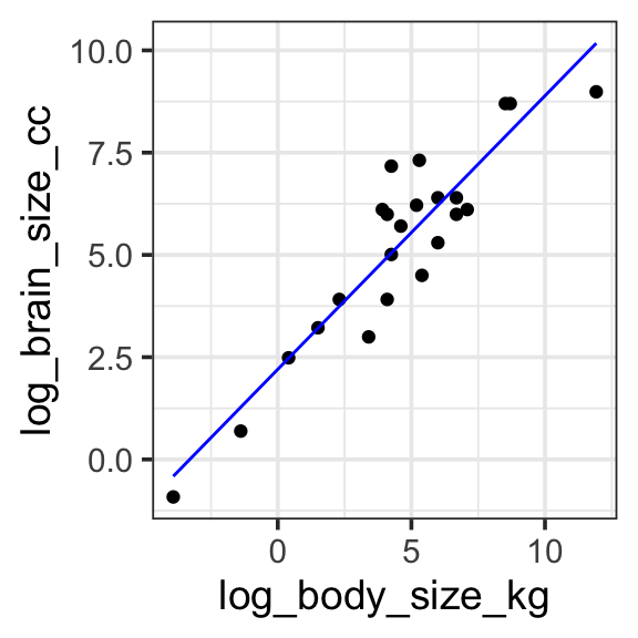
Model specification:
\(log(y) = w_1\cdot\mathbf{1} + w_2 \cdot log(\mathbf{body\_size\_kg})\)
Call:
lm(formula = log(brain_size_cc) ~ 1 + log(body_size_kg), data = brain_data)

Coefficients:
      (Intercept)  log(body_size_kg)
           2.2042             0.6687
Fitted model:
\(log(y) = 2.2042\cdot\mathbf{1} + 0.6687 \cdot log(\mathbf{body\_size\_kg})\)
| Species | brain_size_cc | body_size_kg | log_brain_size_cc | log_body_size_kg | with_predict |
|---|---|---|---|---|---|
| Mouse | 0.4 | 2.0e-02 | -0.9162907 | -3.9120230 | -0.4116321 |
| Rat | 2.0 | 2.5e-01 | 0.6931472 | -1.3862944 | 1.2772249 |
| Rabbit | 12.0 | 1.5e+00 | 2.4849066 | 0.4054651 | 2.4753051 |
| Cat | 25.0 | 4.5e+00 | 3.2188758 | 1.5040774 | 3.2099046 |
| Dog | 50.0 | 1.0e+01 | 3.9120230 | 2.3025851 | 3.7438358 |
| Sheep | 150.0 | 7.0e+01 | 5.0106353 | 4.2484952 | 5.0449906 |
| Pig | 300.0 | 1.0e+02 | 5.7037825 | 4.6051702 | 5.2834853 |
| Goat | 450.0 | 5.0e+01 | 6.1092476 | 3.9120230 | 4.8200046 |
| Gorilla | 500.0 | 1.8e+02 | 6.2146081 | 5.1929569 | 5.6765155 |
| Horse | 600.0 | 4.0e+02 | 6.3969297 | 5.9914645 | 6.2104467 |
| Human | 1300.0 | 7.0e+01 | 7.1701195 | 4.2484952 | 5.0449906 |
| Chimpanzee | 400.0 | 6.0e+01 | 5.9914645 | 4.0943446 | 4.9419160 |
| Dolphin | 1500.0 | 2.0e+02 | 7.3132204 | 5.2983174 | 5.7469660 |
| Whale (Orca) | 6000.0 | 5.0e+03 | 8.6995147 | 8.5171932 | 7.8993037 |
| Elephant | 6000.0 | 6.0e+03 | 8.6995147 | 8.6995147 | 8.0212150 |
| Blue Whale | 8000.0 | 1.5e+05 | 8.9871968 | 11.9183906 | 10.1735527 |
| Giraffe | 600.0 | 8.0e+02 | 6.3969297 | 6.6846117 | 6.6739274 |
| Rhinoceros | 450.0 | 1.2e+03 | 6.1092476 | 7.0900768 | 6.9450462 |
| Walrus | 400.0 | 8.0e+02 | 5.9914645 | 6.6846117 | 6.6739274 |
| Tiger | 90.0 | 2.2e+02 | 4.4998097 | 5.3936275 | 5.8106962 |
| Kangaroo | 50.0 | 6.0e+01 | 3.9120230 | 4.0943446 | 4.9419160 |
| Crocodile | 200.0 | 4.0e+02 | 5.2983174 | 5.9914645 | 6.2104467 |
| Penguin | 20.0 | 3.0e+01 | 2.9957323 | 3.4011974 | 4.4784353 |
model <- lm(log(brain_size_cc) ~ 1 + log(body_size_kg), data = brain_data)

brain_data <- brain_data %>%
  mutate(
    log_brain_size_cc = log(brain_size_cc),
    log_body_size_kg = log(body_size_kg)
  ) %>%
  mutate(with_predict= predict(model, brain_data))

brain_data %>%
  ggplot(aes(x = log_body_size_kg, y = log_brain_size_cc)) +
  geom_point() +
  geom_line(aes(y = with_predict), color = "blue") +
  theme_bw(base_size = 14)
6 Further reading
- Ch 6: Language of models in Statistical Modeling